
Our logo

Since St. Michael’s came together in the 1970s we have had a couple of logos.
A logo tells the world who organisations are, sometimes what they stand for, and they are often the first things people see when they connect with an organisation.
The current St. Michael’s ‘hands’ logo was designed in the past eight years as part of a rebranding of the Parish.

Recently, St. James’ Church has changed their logo to one which closely matches that of the Primary School and represents the Scallop shell imagery of St. James, this is most famously seen on the Camino de Santiago pilgrimage way in Southern France and Northern Spain.
I wonder if the time has come for us to also consider our logo and wordmark.
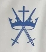
On old paperwork, I found this copy of the original logo which was used when St. Michael’s opened in the 1970s and the possible ‘new’ logos are based on this original.
The Symbology of swords and a crown represent Michael as an warrior saint which is often seen in icons of St. Michael. The Cross and crown are also to remind us that everything is centred in Jesus.
Please have a look at the following images and then send an opinion on the form below:
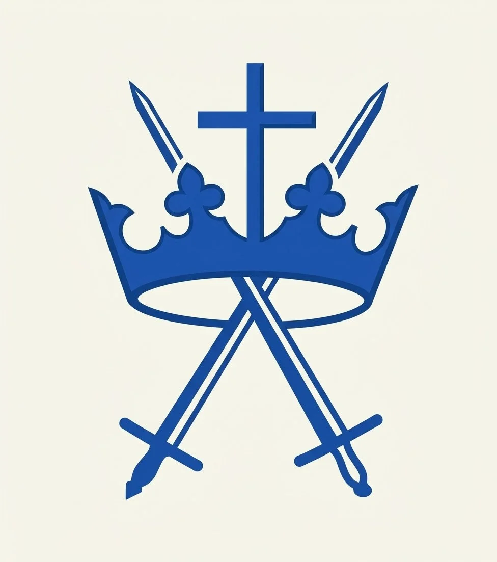
OPTION 1:
An enhanced image but still basically the same as the original
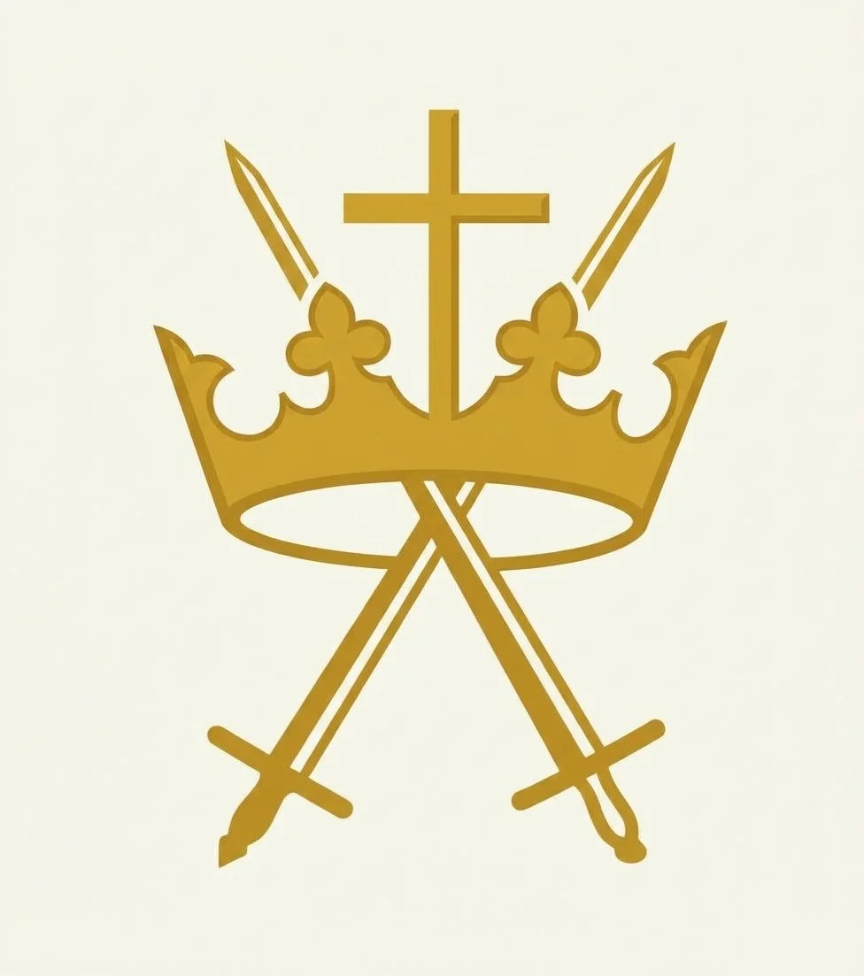
OPTION 2:
The same image but Gold
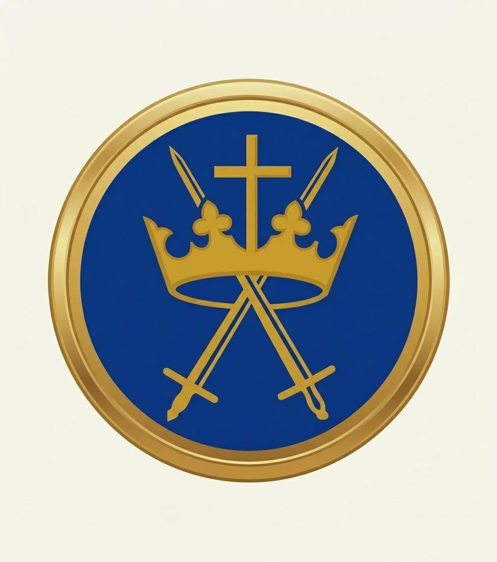
OPTION 3:
Blue and Gold Badge design
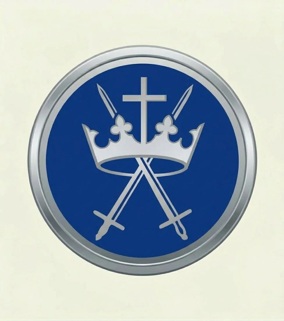
OPTION 4:
Blue and Silver Badge design
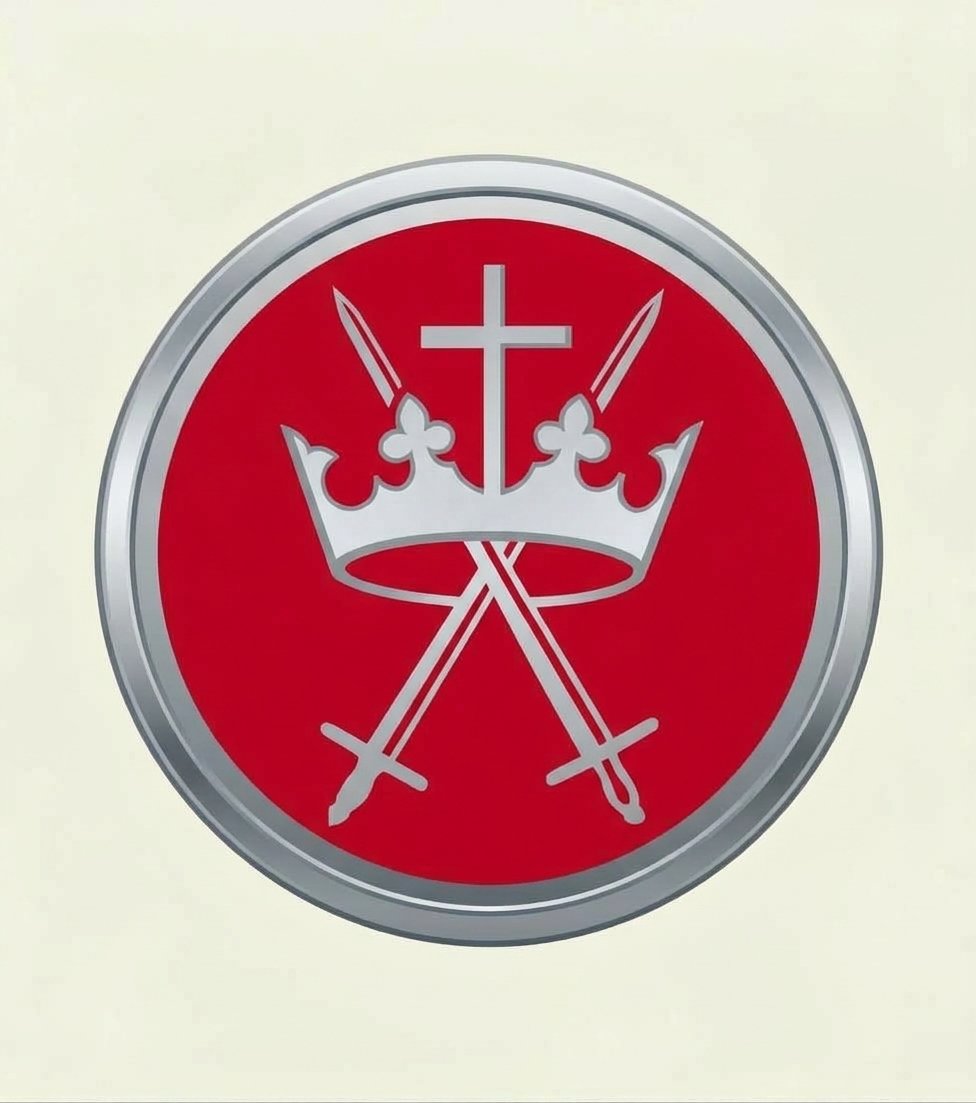
OPTION 5:
Red and Silver Badge design
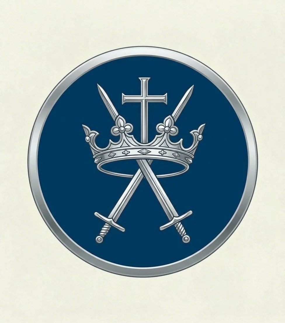
OPTION 6:
Ornate Blue and Silver Badge design
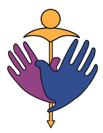
OPTION 7:
Make no changes and keep the current logo